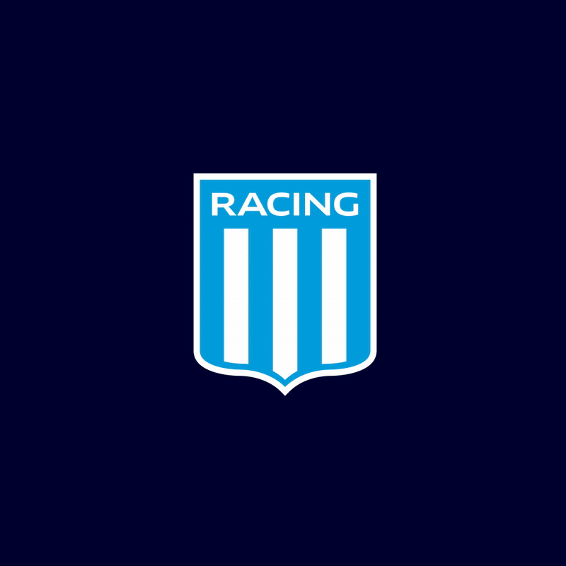
When Argentinian soccer team Racing Club de Avellaneda needed to update its look, it turned to internationally known design firm Superestudio.
Superestudio immediately considered what defines Racing Club and determined that the team’s story is one of firsts – from seven consecutive championships in Argentina’s Primera División to playing in a fan-built stadium. Superestudio’s challenge was to honor the team’s legacy while positioning it for a new era of growth and connection.
“At its core, design is problem-solving,” said Ezequiel Rormoser, executive creative director, Superestudio, in a statement. “Our goal was to express Racing Club’s identity as both heritage and progress – something timeless, yet alive in every interaction.”
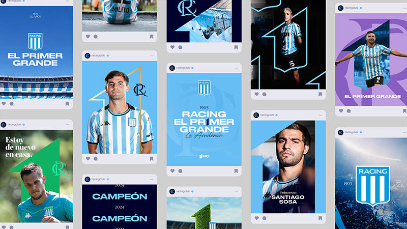
When considering how to express this challenge across a modern brand ecosystem, it came down to a simple yet powerful design idea: the number one.
“As designers, we always start with a question,” continued Rormoser. “For Racing Club, it was: how do you visualize being first? The answer wasn’t just about form, it was about meaning. The number one became both a symbol and a mindset.”
By reimagining the shapes within the team’s iconic Racing Club badge, Superestudio crafted the number one as a visual reminder of both the club’s pioneering spirit and its standard of excellence. This symbol became the foundation for every design decision, from typography and motion to digital interactions. From digital screens to stadium signage, broadcast graphics to merchandise, the identity reinforces a unified experience: Racing Club is “the First of the Greats.”
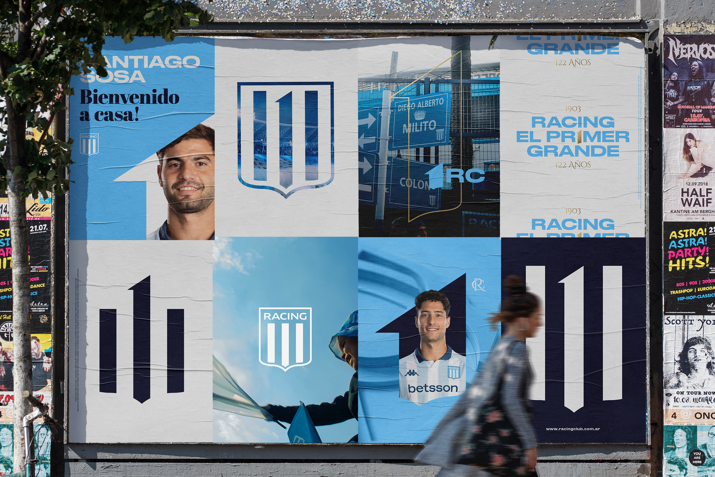
“The challenge was to design an identity that feels as powerful on a giant stadium screen as it does on a mobile feed,” added Rormoser. “Every scale had to communicate the same message, that Racing is the First of the Greats and is still leading the way.”
Every visual element in the rebrand was crafted to adapt fluidly to whatever context it was being used in, whether that was bold enough for the stands, refined enough for digital or flexible enough to live wherever Racing Club’s story unfolds.
At the heart of this transformation is a clear strategic idea: being first means setting the standard. This principle guided every aspect of the creative process, ensuring consistency, clarity and emotional impact across all platforms. The result is more than a visual identity, said Superestudio, it’s a strategic design system that embodies ambition, leadership and pride.